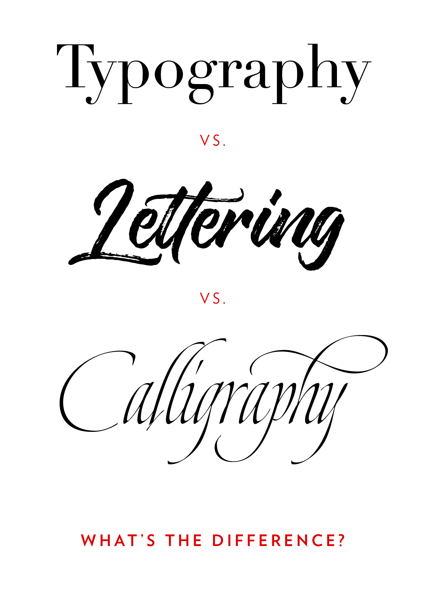
The Difference between Calligraphy and Lettering, and Typography
March, 2015 | Last updated: March, 2020
Are the words calligraphy and lettering and type just different ways of saying the same thing?
You know, kind of like, “I say, ‘tomayto’, you say, ‘tomahto’?”
Well, the short answer is no. There is a difference. And if you dabble in any one of them, it’s important to know!
Why Are We So Confused (and does it matter)?
One reason even design professionals don’t always use the correct terminology when referring to type and lettering is because the tool we use today to create them both is often the same—the computer. A nib—or brush, or quill, or a stylus if you’re gonna go way back—and ink used to be the only tool used to create letters by hand, and then eventually the tool for type was the printing press.
Although there are many shared similarities, creating work with calligraphy, lettering and type are rather different disciplines.
OK, I get it, for the average person the difference is rather moot, but there are several reasons I think it’s important to have at least a superficial understanding of what makes each distinct from the other. This is especially true if you do any of the three yourself, or if you ever commission a professional to do work for you (at the very least you want to make sure he/she knows them too!).
Creating lettering by hand is time consuming; perfect for invitations and signage, but typically impractical these days for a 500-page novel—although there are delightful exceptions to this including an almost 15-year endeavor of several highly talented scribes to hand-letter the 1,127-page The Saint John’s Bible. The project’s price tag ultimately reached $8 million (!).
Lettering and typography are two very different approaches to generating letters. A professional can be good at handling both, but not all designers are.
Hand-lettering represents a different time commitment and therefore may be priced differently than projects using type.
Like a snowflake, there are no two hand-lettering projects that are exactly the same. If you want a one-of-a-kind, customized piece, hand-lettering is what you seek.
So on to discuss the three:
Calligraphy
Calligraphy is a type of lettering, and yet, it isn’t. In the simplest of terms from typography and design expert Gerrit Noordzij, calligraphy is writing—a single pass of the pen/tool to write as a form of art; whereas lettering consists of built-up letters—drawing with multiple strokes; and typography is writing with prefabricated, pre-designed letters. This is, in essence, what really defines the three from each other.

The Oxford Dictionary defines calligraphy as “decorative handwriting or handwritten lettering”, which is how many people perceive it. I like to also think of calligraphy as a discipline—akin to playing an instrument—whereby the practitioner has to develop the skill through constant practice and growth.
Even though calligraphy, lettering and typography all use the same principles for spacing, consistency, weight and contrast to determine what is “good”, they are all distinct disciplines. In my work, I do calligraphy and lettering, but also use type as a designer—wielding pre-designed letters (i.e. fonts) to create a finished piece. I have formally studied typeface design (the discipline that leads to the creation of the prefabricated letters that are fonts and typefaces), but these days choose to focus on being a student of calligraphy and also to create lettering by hand.
Lettering
I like to think of lettering as having a bit of a split personality. On one hand, it’s a illustration of letters that come together to create a design that is intended for one configuration only. When a designer is lettering, he/she is creating art where the focus is on the whole, unique composition, rather than ensuring the individual pieces could work if thrown together in another way. For most lettering projects, if the individual alphabet characters were to be rearranged, it would most certainly look like amateur hour!
On the other hand, it happens to be a string of letters that we read as words or phrases. A lot of what is described as being calligraphy these days is often really just lettering. Remember, back to Gerrit Noordzij's definition, lettering consists of drawn letters, created with multiple strokes.
Typography
Type designers have to respond to the lowest common denominator. They have to consider an endless array of different letter combinations and design each letter accordingly to ensure that no matter the layout, the individual alphabet characters will meld together beautifully when strung together to create words or phrases. Think about how the words you're reading right now consist of the exact same letter formations, yet look seamless together. That's from the hard work of a type designer. Remember, fonts weren’t always digital files stored in computer folders; each letter used to be individual pieces of metal, stored in drawers in print shops and assembled by hand as necessary!
Designing type is a very time-intensive process. Many typefaces were in the works for years before being released commercially. Often confused, but actually separate disciplines, type designers create type (manifested as those font files you can download) while graphic designers are often just using and arrange the type in their work (although some graphic designers have also created their own typefaces). “Typography” as a term refers more to the wielding of letters to form compositions, rather than to the designing of them.
Tips: Try Your Hand at Lettering
I spend hours practicing calligraphy, creating hand-lettered designs, and using beautiful existing typefaces to create work. Here are a few tips for novices who want to experiment with some hand-generated letters themselves:
Research
Be on the lookout for great examples of lettering found on menus, old building signage and in antique shops. Even take inspiration from old movie titles! Take the examples home or snap a picture to use as inspiration. When traveling, especially to Asia, the Middle East and Europe where royal scribes through the Middle Ages created amazing hand-lettered art, be sure to absorb the lettering you see. Religious buildings are often a great source of old letterforms.
Trace
Print out some examples of great type and then trace the forms. This helps your hand and mind “get the feel” of the letterforms. Start with an old style serif such as Garamond from the 1500s and move on to more modern typefaces such as Bodoni (serif) and Helvetica (sans serif). Take note of the shapes, but also pay attention to the relationships between the forms and where the thicks and thins are in each letter. Practice: Although you want to be sure you have the proper space and proportions, trust your gut (well, more your eye!) rather than precise measurements when hand-lettering. At the end of the day, letters should work together optically as opposed to purely logically or based on rules of measurements and precision.
Study
Look at old, and I mean really old examples of lettering such as that found on Trajan’s column to try to understand how the letterforms evolved because of the types of tools available in each time period. Certain letterforms existed because the tools used for the lettering—such as the chisel, quill and stylus—only afforded certain movements and shapes. If you really want to dig deep and get a fundamental understanding of why letters are shaped the way they are, give calligraphy a shot and try learning Foundational Hand (and other styles if you like it!)—it will help inform your eye and mind and give you a better grasp of spacing and letter proportions.
Just to note: the graphic above was created entirely with fonts (and therefore is an example of typography) made to resemble hand-lettering and hand-calligraphy.