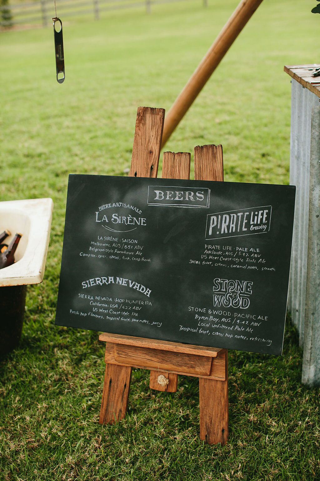
Crafting Chalkboard Signage: Tips and Tricks
May, 2015 | Last updated: March, 2020
Decor for home or events, permanent or temporary!
Whenever you want a “by hand” feel as opposed to perfectly made items, chalkboard signage is a delightful way to go. While they’re perfect for weddings and events that are rustic, outdoors, or include vintage elements or nature in the décor, they also work beautifully in more elegant and upscale settings too. Bottom line is that they’re versatile depending on how they’re designed and crafted.
I’ve seen chalkboard signage used in many ways from small place settings to large photo booth backdrops, and menu boards to table numbers—the sky (or your imagination) is the limit! Here are a few tips from if you want to use this very popular method.
1. CHOOSE CHALK
For most applications, I use pretty standard chalk—y'know, the kind teachers used before dry-erase and SmartBoards. I’ll even dip into my stash of Crayola sidewalk chalk if I’m working on a large, rough surface. They were perfect for the time I created a one-of-a-kind sign on a huge, outdoor brick wall. For detailed work or to sketch the layout at the start, chalk pencils are my go-to tools.
I’m a purist at heart, so honestly I prefer using real chalk rather than chalk pens for a more authentic look, but it's best to let the needs of the client and project dictate the right tools for the job. When a piece needs to have the longest life span possible, I use Chalk Ink brand chalk pencils or something similar.
2. PRIME IT
For best results, don't forget to prime the chalkboard surface to prevent any ghosting—an imprint of the words or art on the board even after erasing. Priming fills in the little holes in the porous board so ghosting won’t happen and allows for easier erasing. Lay a piece of chalk on its side and roughly cover the entire surface with chalk, and then rub it off with a dry rag, or even a schoolroom chalkboard eraser. If you happen to be using chalkboard paint, a priming layer has the added bonus of giving the wall a more “chalkboard” look instead of appearing as a regular ol’ painted black wall.
3. PLAN IT
Even though part of the delight in using chalk is getting a not-too-perfect result, it’s still important to plan and sketch your design on paper first. Also, don’t forget the purpose of the piece when dreaming up the design. If the chalkboard is meant to be used to provide information, clarity should be a priority! Otherwise, approach it however you want, though it’s never a bad idea (says the graphic designer in me) to keep design principles—balance, proportion, hierarchy, space, etc.—in mind when you create a layout.
Keep it simple, so you can have a harmonious composition, and use different typefaces and lettering styles sparingly. Too many different kinds in a single layout can be jarring to look at and much too cluttered. It's important to choose elements that complement each other.
For those that don’t create signage professionally, sometimes the most challenging part of all of this is the proper scaling when you try to transfer a design concept from paper to a large chalkboard. The most basic way is to use the grid method; basically drawing a grid over the original artwork and then drawing a grid of equal ratio on your work surface. After, you focus on drawing and enlarging one grid at a time. Projectors are also an option for really large work, but beware! If its not absolute perfection you’re looking for, you risk losing that delightful hand-made quality. One way around this is to use the projector to mark out the important parts of the layout, and then free-hand the rest.
4. SIGN TIME!
With the prep work out of the way and your plan in hand, it’s time to start drawing! Even though imperfection adds to the charm of your chalkboard signage, you will need to erase from time to time as you work. To erase the actual artwork, I simply use a damp lint free rag (an old cotton T-shirt works, or a microfiber towel), and sometimes a paintbrush with water if I need to accurately erase/shape around letters and forms. Often though I will work with only chalk and paper towels—you can work with just the basics!
Liked this? Subscribe below for more inspiration direct to your inbox!


